Heatmap
Mobile vs. desktop
See the heatmap for mobile visitors and for desktop visitors, and how the same page works on each.
What you see
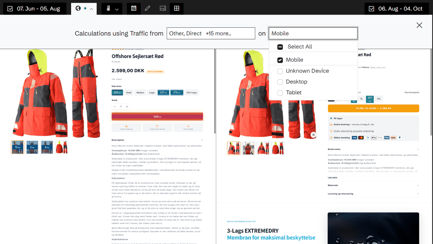
Filter the heatmap by the visitors' device: desktop, mobile or tablet. The colours and numbers change to show only that traffic, on every metric.
Where Historian captures the mobile version of your site, a switch on the toolbar shows the mobile page itself, with the heatmap of the mobile visitors on it.
Why it matters
The same page is two different pages on a phone and on a laptop. Elements move, collapse into menus or disappear. An average across devices hides the mobile problems, and on many shops mobile is where most of the visits are.
An example
On desktop, the filter sidebar on a category page gets a third of the page's clicks, and the sessions that use it convert well. On mobile, where the filters sit behind a button, almost nobody uses them. That is a mobile fix with a desktop number to aim for.
More in Heatmap
Heatmap overview →Time Machine
Go back to any version of a page, with the heatmap for exactly that version and a written summary of what changed.
Version comparison
Put two periods or two versions of a page side by side, each with its own heatmap and its own numbers.
Revenue per click
Colour the page by what a click on each element brings in, not by how often it is clicked.
Click products
See which products were bought by the visitors who clicked an element.
Click transitions
See which pages visitors went to after they clicked an element, and what those visits were worth.
Template heatmaps
Add up the same element across every page built from one template, and see where it works and where it doesn't.
Element drill-down
Click any element on the heatmap and follow its numbers day by day, with the days it changed marked on the chart.
Heatmap metrics
Eleven metrics for every element on the page, from clicks to revenue per click. Colour by one and show the numbers of another.
Traffic segments
Filter the heatmap by where the visitors came from, and see how each channel uses the page.
Experiment heatmaps
A heatmap for every variant of your GrowthBook experiments, and two variants side by side.
Related features
All features →Traffic segments
Filter the heatmap by where the visitors came from, and see how each channel uses the page.
Heatmap metrics
Eleven metrics for every element on the page, from clicks to revenue per click. Colour by one and show the numbers of another.
Devices
Desktop, mobile and tablet side by side: revenue, conversion and order size for each, against a benchmark.
Stop guessing why revenue dropped.
Book a demo and we'll show you what Historian finds on your own store.