Works with any e-commerce platform


Dive into our features to see exactly how you can benefit from Historian.


Historian constantly analyzes your webshop to provide insights into what is happing on the webshop. Every insight it finds is automatically posted to the Social Feed. If a page, product, or price has changed, then it is reported. If there is a sudden spike or drop in a KPI then it is also posted.
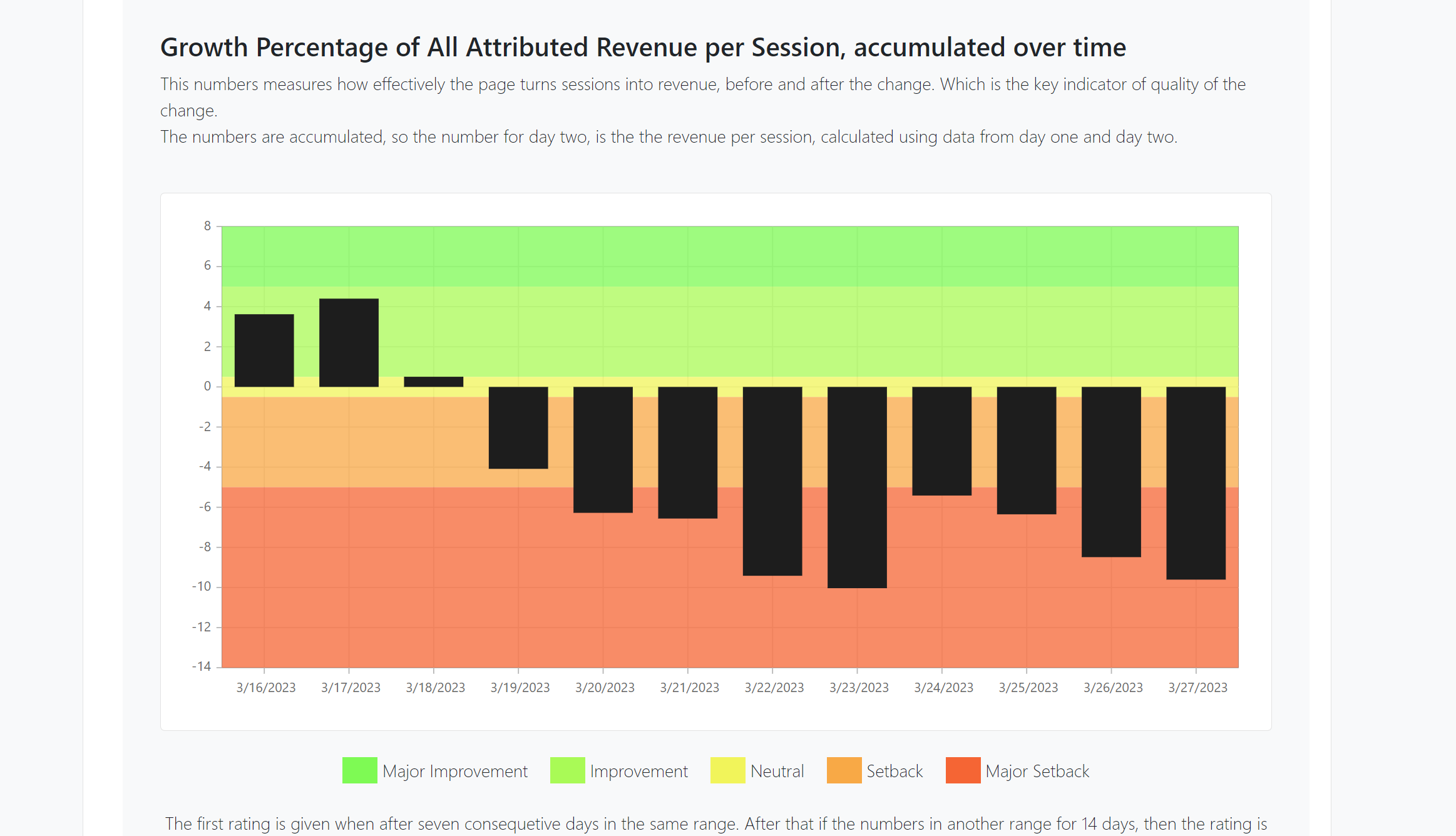
But perhaps most importantly when Historian has collected enough data to conclude as to whether a change was an improvement or a setback, then it is also posted. So everybody can learn from it.
We suggest you give your entire team plus stakeholder’s access to Historian, maybe even invite any external agencies. This way everybody will always be on the same page and always learning.

Every post in the Social Feed includes social features, everybody is free to like or comment. Historian also includes a feature to take credit for being involved in the change. Managing online teams and external agencies is a complicated matter, spanning many different roles and competencies. The Social Feed introduces a new level of transparency into what is being done online. This makes both management and improvement much easier.
The way Historian measures whether a change is an improvement or a setback is fully transparent and can be followed by clicking on the Post of the Change.
This enables contributors to the change, to see how is it doing and possibly do corrections if necessary.
This enables a culture of learning from editing and design changes, in stark contrast to today, where most changes are made through any follow-up learning.

Historian automatically e-mails a weekly summary of the posts to all users.
Imagine returning from a long summer holiday and being caught up by just reading a couple of e-mails. Imagine knowing that your team didn’t have to spend time writing them.
Understanding KPI movements is essential to improving them, however, KPIs in e-commerce often move fast and erratically, it can be very difficult to see whether the movements are caused by changes made, changes that should have been made, changes in trends, or just random variations.
Historian helps to make sense of the movements by providing the Explain functionality. Which breaks down what caused the movement.
This is done by calculating the Impact of every Factor that influences the KPI. A Factor can be a Page like the front page, a traffic source like Google Ads traffic, a device like Mobile, etc.
To calculate the Impact of a Factor the percentage of observations of the Factor is multiplied by the KPI Value for the factor. So if 50% of the traffic is mobile and it has a Conversion Rate of 5%, then the Impact is 50% * 5% = 2.5%.
Impacts are great at showing how the different factors influence a KPI. But they are brilliant at showing KPI movements. By comparing the difference in Impacts from all the different factors, and ordering by their absolute size, it becomes evident which Factors drove the KPI Movement.
Historian does this in a waterfall diagram, so it is easy to understand the movements and what drives them.
Too many design and content decisions are made based on gut feelings. While split testing is great for UX changes, it is too slow and cumbersome for testing design and content. There just are not enough Black Fridays in a year to do meaningful testing of optimal Black Friday campaigns.
But even though we can’t get the nice statistical significance levels of hypothesis testing, we can still learn and get actionable insights from our changes. At the page level Historian does this using heatmaps.
So preparing for next Black Friday can include detailed analysis and insights on what exactly worked last Black Friday and what did not.

Historian uses zone-based heatmaps, where the entire element is assigned the color corresponding to the value, which makes them easier to read.
In addition, Historian’s heatmaps also show numbers such as Conversion Rate after click, Revenue per click etc.
The default setting is Conversion Rate as text and Number of Clicks as color. That means that the blue zones with High Conversion Rates are likely candidates to be highlighted for achieving a higher Conversion Rate.
Historian shows you both where the users clicked and where you want them to click.
Historian does change detection each time it generates heat maps, and creates a new version each time a page has changed, which makes it easy to see the detailed effect of a change. But we also enable it to show correct heatmaps. Because showing a heatmap for a front page that changed dramatically three days ago, with one month’s worth of click data is simply misleading.


Knowing where to begin is often half the battle. Historian generates heatmaps for every single page on the webshop, every single day, that is a lot of heatmaps.
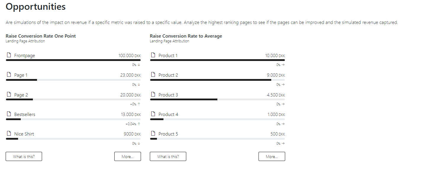
To navigate where to start when optimizing for a specific KPI, Historian provides reports that tell where an optimization will have the most significant effect.
Phone: +45 26 37 79 13
Email: contact@historian.ai
Privacy Policy

CVR-nr: 43717715
Strandvejen 157, 1.th.
2900 Hellerup
Denmark